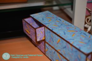
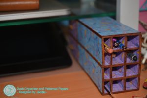
Storage. When you enjoy a lot of creative pursuits, space is at a premium. And when you buy pre-made storage – you always end up with those awkward little gaps. You know the kind – they sit there and tease you about how they could be useful. They have the potential to be really useful to you, but they end up either tantalizingly empty or stuffed with higgledy-piggledy clutter.
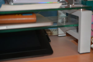
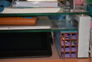
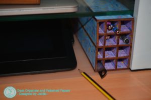
I had just this sort of gap under my monitor riser. My Cintiq sits on the bottom shelf, but it leaves a big gap of a few inches next to it. Admittedly, it wasn’t very wide – but it was a good few inches. It was also very deep. All that wasted space! 😮🤔
This kind of format was too awkward to go looking for a pre-made solution that has just the right dimensions. If I did find something that happened to fit – I’d probably have been left with more unutilized space! This called for something totally unique. So, I set about designing something. I decided pens and pencils for traditional drawing and writing would sit there very nicely. (Remember those?) Since none of those things go much over 15cm, I still had a bit of unused space at the back. Hmmm… more about how I dealt with that later.
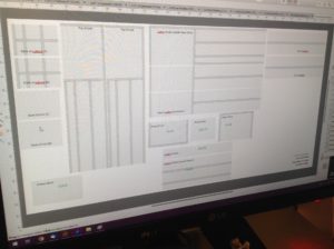
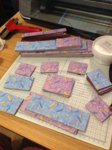
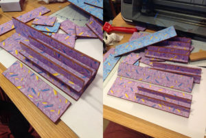
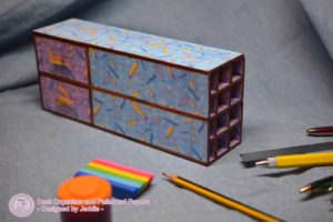
I chose to use chipboard, cut on my ScanNCut, and layered it up for this project. I was inspired by the method used in Cutting Craftorium’s Pretty and Purposeful USBs. This would help me keep the walls thin, and sturdy. I measured the average thickness of a stack of two layers of paper (one for each side), and a stack of three layers of 1mm chipboard. That way, I could work out the tolerance I needed to add, to work out the perfect size for each piece. Since the pens and pencils will lay horizontally, I wanted to subdivide a lot – so I didn’t have to rummage. That made for a lot of pieces – and a complex network!
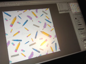
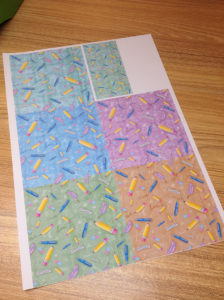
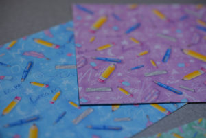
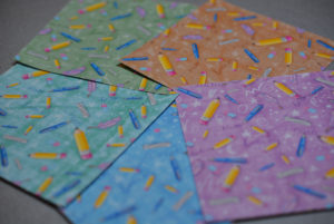
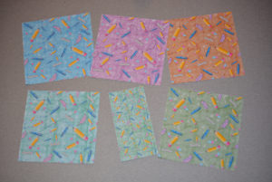
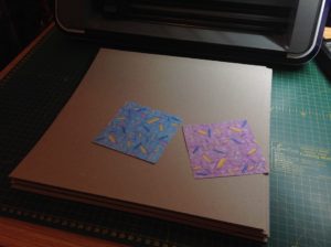
Since I designed all the structure on my own, it didn’t feel right to use an ‘off the peg’ paper pattern, either. So, I chose to design my own paper pattern. I drew and coloured it digitally, on my Cintiq, and made it tiling using Krita’s wrap view. I then printed it. I love bright colour – and I mean bright colour. That’s not easy with an inkjet printer because of its limited colour gamut, and because I’m used to designing for screen space, where you are helped by the light behind it. Designing using a CMYK colourspace helped me narrow down how I could achieve a result closest to what I wanted. After trying lots of different papers, I found that Create and Craft’s new Core Pro Paper helped me get the crispest and brightest result I could with my ordinary home printer.
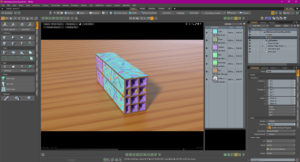
I made a digital model of my design in Modo, and used that to decide which colour of my paper designs to put where. Here’s the digital model:
So – I had designed my vector cutting files for my ScanNCut. I’d designed my papers, and they were printed and ready. I’d tried out and chosen colours in Modo. Time to get into the crafty stuff! 😁
Cut all the chipboard layers on the ScanNCut! (Three per piece, remember.)
Cut all the paper pieces to match on my ScanNCut! (Two per piece, remember)
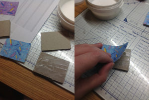
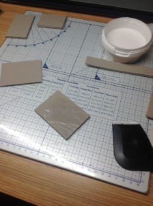
Glue, glue, glue! Laminate all the pieces up with Pinflair Bookbinding Glue on a nice wide spatula.
Now, you can see the chipboard edges. The giveaway! I ran an alcohol marker along each edge to make all the edges a warm brown. It now looks a little like finished plywood, rather than card, which is a very nice look! It reminds me of a vintage shop or vintage school paraphernalia…
The chipboard becomes so thick, you can actually glue it edge to face (at right angles), and have it hold nicely. The inner dividers add even more strength – with every edge glued. I used Bookbinding Glue in a bottle to apply to the edges (Pinflair Glue-it).
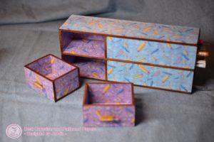
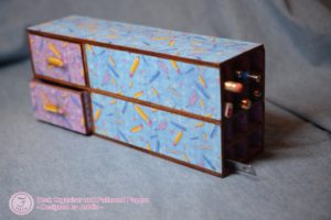
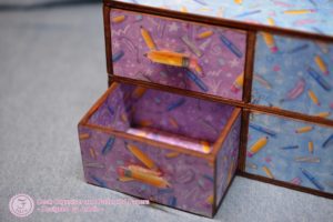
Now. As for that space at the back that I mentioned earlier. I chose to make this into two drawers. That way, I can slide the unit forwards, from under my monitor riser, and access the space at the back! One drawer can hold erasers and pencil sharpeners. The other can hold USB sticks, spare nibs, SD cards, etc. I made the drawers with the same technique as the rest of the project – chipboard and card! I opted to make the middle shelf split the unit into two sections – for more stability for the ‘shelf’ that separates the drawers.
The only measurement I got wrong was the front of the drawers. They were too tall by one thickness of the material. Oops! I only found out once I had laminated them, but to my delight, I found a Stanley knife/box cutter cut thorough the laminated card beautifully cleanly and smoothly, and I was easily able to trim off the extra 3 or 4mm, and make the drawer fronts fit. I was even able to use those offcuts to raise the drawer handles!
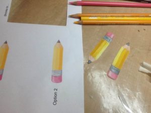
Speaking of drawer handles, I chose to use Shrink Plastic to hand color pencils that match my paper design so I can pull the drawers out easily.
To finish off, I used Distress Micro Glaze (a type of finishing wax) over the top of the paper to protect it from knocks and debris, and stuck two punched circles of shrink plastic (unshrunk), to the bottom of the unit, at the back – so it slides more easily, and so it doesn’t get a scraped bottom.
All done, and ready to hold stationery under my monitor riser! To see more finished pictures, please see my Portfolio.
